
I’m going to be frank. Perhaps even blunt at various points, but bear with me. Yesterday, Formula One Management registered three potentially new logos. I have several problems with this.
Firstly, the logo isn’t what’s wrong with Formula One. Ever heard the phrase ‘if it ain’t broke, don’t fix it’? Yeah. That. The F1 logo, as we know it, has become the face of a brand, and is one that doesn’t need changing. It works, it’s unique and, as a result, people recognise it. If we start messing around with what the face of the sport looks like and not the sport itself then we’re never going to put ourselves back in the position we were ten years ago.
Liberty need to be tackling the root cause; the racing itself. Cars that can’t follow each other, ludicrous engine rules, utterly ridiculous and unnecessarily complicated penalties as well as the insane historic payments to certain teams are just a few of the issues that immediately come to mind.
Someone on Twitter mentioned that FOM want to align the logos of F1, F2 and (eventually) F3 much in the same way MotoGP does with Moto2 and Moto3. The notion that they’re all visually identical, and as such it’s immediately obvious they’re part of the same brand/organisation. I get that, and I get why they want to do it. However, surely F2 and F3 should be incorporated into F1? This reminds me of what happened at the US Grand Prix when they pushed the start of qualifying back two hours later than normal so people might be inclined to stay and watch Justin Timberlake. That’s wrong. The main focus of the weekend is Formula One, so why on earth are you moving that main focus for a supporting event? People come to watch motor racing, not a pop concert. It’s a painfully backwards way of doing it.
Secondly, the logos themselves look hideous. To be brutally honest, they look like something a GCSE graphics student would come up with in his first lesson in year 10. Actually no, that would be unfair to the graphics student.
- Source: F1 Broadcasting
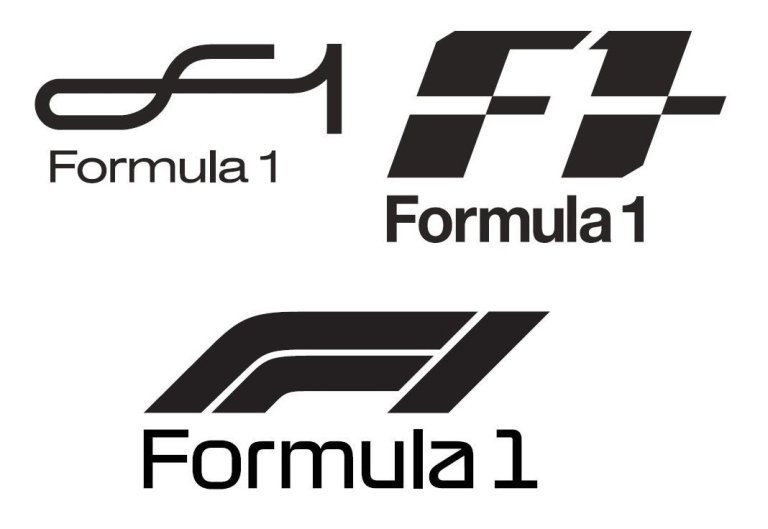
Just look at them. I get what they’re meant to look like; the first one is a track, a hairpin and a figure-eight, reminiscent of Suzuka, but the ‘f’ is so vaguely an ‘f’ it just becomes one disoriented squiggle. Alright, I admit I’m struggling with the second one. What is it exactly? Is it a pair of grid slots? Is it a white line in the middle of the road? What it actually looks like is one of those horrific things you’d see on a terrible 1980s arcade machine, and features what could be the most dismally plain and boring font imaginable. The third one, whilst no means good, is perhaps the best of the three. It’s a corner, and is the only one of the three that immediately screams motor racing. Well maybe not ‘scream’, but in comparison to the other two? It somewhat represents what the sport does/is.
Thirdly, surely this can’t be the best they can come up with? I’m going to assume not and that these are actually very early versions of a more complete overhaul. But if they were willing to attempt to register these with the European Union IPO that sort of suggests they are the best doesn’t it? Based on what we’ve seen, whatever comes next, if anything at all, might not be any better. For all the good that’s come of the past twelve months I seriously hope this doesn’t tarnish the record.
Fourth, and whilst not directly related to the logos, the logos themselves could be a result of it; CEO Chase Carey recently said that FOM hired the ex-president of Fox Sports because F1 hasn’t done enough to innovate the viewer’s experience compared to that of ten years ago, just a mere matter of days after F1’s commercial boss Sean Bratches said the complete opposite. I’m moved to agree with Sean, ten years ago we didn’t have things such as driver trackers, 180° rotating cameras or the enhanced features we get from live timing. We didn’t even move to a 16:9 picture format until 2007. This year we’ve seen the move to ultra high-definition and various new graphics explaining finishing positions, new records and other stats that help new viewers understand the sport. More has happened in this one season alone than the past five years. So what exactly was Chase talking about?
For FOM themselves to not actually know what direction they’re going in or what direction they were previously going in doesn’t fill me with much confidence. It’s going to result in a bunch of half-hearted efforts, much like these logos seem to be. F1 doesn’t need half-hearted. Half-hearted isn’t what Liberty promised when they took control. For too long F1 has suffered from a broken philosophy, Bernie failing to grasp the concept of the 21st century for instance. Whilst trial and error will play an enormous part in Liberty’s strategy, you can’t play around with the face of a brand, the literal first thing viewers see when they tune in. The logo of a brand takes years to gain the recognition and identity that only a logo can, if you start chopping and changing that then the brand loses that identity, and you begin to see people detaching themselves from it. Change is inevitable of course, but some things should perhaps stay the same, at least for the time being. Focusing on fixing what’s actually wrong first.
Feature image courtesy of F1 Fanatic
